A systems problem, not a UI problem
Enterprise legal teams run the business on logic most people never see. Conditional clauses. Escalation paths. SLA timers that quietly decide whether a deal moves or stalls.
This project tackled a hard truth: when ten plus stakeholders edit the same non-linear workflow, clarity collapses. Logic drifts. Accountability blurs. Audits turn into archaeology.
The bigger win? We shifted how teams think about contracts. From documents to logic. From static artifacts to living systems.
The reframe
"How do you preserve a single, legible truth when many actors edit different parts of a shared logic graph, asynchronously, under pressure?"
The answer required moving away from document-centric thinking toward logic-centric CLM. The workflow itself became the primary artifact. Versions were no longer files. They were states of a system.
Constraints that drove hard tradeoffs
I anchored the work around three pillars. These were not slogans. They were constraints I used to make hard tradeoffs.
1. Functional transparency
Most workflow errors are invisible. A threshold changes from 30 to 45 days. A condition flips polarity. On paper, nothing looks broken. In reality, millions are at stake.
I used visual cues like glows, ghosted nodes, and color-scoped highlights to expose logic changes instantly. Neon green signaled additive behavior. Ruby red marked removal. No guessing. No hunting.
If logic changed, the interface made it impossible to miss.
2. Contextual depth
Legal teams need detail without losing orientation. Flat lists fail here.
Glassmorphism and z-axis depth let me layer information without collapsing context. The Difference List floated above the canvas, always reachable, never dominant. Users could dive into a change and still feel where it lived inside the broader system.
Think of it like reading marginal notes without losing the page.
3. Operational trust
This one is subtle but critical.
In high-stakes environments, visual precision equals credibility. If spacing is sloppy, users subconsciously doubt the math. So the interface leaned hard into pixel-perfect execution. Expressive Inter typography. Consistent rhythm. A Work OS aesthetic that felt engineered, not decorated.
The design had to earn trust before users ever tested it.
Visualizing the diff
Comparing two workflows is not like comparing two documents. Order does not matter. Relationships do.
Side-by-side infinite canvas
I chose a side-by-side infinite canvas so users could spatially reason about change. Left was the baseline. Right was the edited state. Zoom and pan stayed synchronized to preserve orientation.
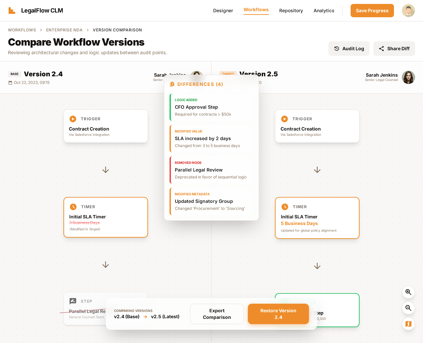
The Compare Workflow Versions interface showing a side-by-side diff between v2.4 and v2.5, with the centralized Differences panel highlighting four distinct changes.
This let teams answer questions like:
- Did this condition move or did it change?
- Is this new logic additive or substitutive?
- What downstream paths does this affect?
Those answers surfaced visually, not through explanation.
The changelog card
Under the hood, a single workflow edit could generate fifty plus micro-changes. Node moved. Label updated. Condition inverted. Showing all of that raw would overwhelm anyone.
So I designed a Changelog Card that aggregated changes into human-readable intent. Not what happened, but what it meant.
"Escalation now triggers earlier for high-value contracts."
Users could expand for detail, but the summary respected their time and cognitive load.
Designing co-authoring without chaos
Here's where it got interesting. Most collaborative tools treat concurrency as a novelty. Legal workflows treat it as a risk.
Presence system
Live cursors. Subtle avatar pulses. Color-scoped highlights that mapped edits to people. Authorship was visible without being distracting.
Soft contested state
When two users touched the same node simultaneously, a clear signal appeared. No alarms. Just clarity that intent overlapped.
Resolution strip
A lightweight inline preview showing outcomes before commit. Merge. Override. Fork. Each option showed downstream impact before anything was finalized.
Seamless audit trail
Every action flowed directly into the audit log. Intent, timestamp, outcome. No extra steps. No broken flow.
This was not about preventing conflict. It was about handling it with dignity.
Cross-functional partnership
At this level, design decisions live or die on collaboration.
Engineering
The infinite canvas pushed performance limits. I worked closely with frontend and infra teams to define rendering boundaries, virtualization strategies, and interaction budgets. We co-designed constraints early so fidelity did not become a liability later.
Legal SMEs
Accuracy mattered more than elegance. I partnered with Legal Ops and senior counsel to validate representations of SLA timers, conditional precedence, and escalation logic. We pressure-tested edge cases until the visuals matched real-world consequences.
Design was the translator between legal intent and system behavior.
Results and reflection
Global standardization
Standardized contract workflows for three Fortune 500 clients across multiple regions.
Audit acceleration
Audit cycles that once took days dropped to hours. 70% reduction in time-to-audit.
Increased trust
Teams stopped exporting workflows for review. They stayed in the system.
Looking forward
Looking back, I would invest earlier in AI-assisted conflict resolution. Suggesting merges. Flagging risky diffs. Predicting downstream impact before humans asked.
But even without that, the project proved something important.
"When you design for systems instead of screens, clarity scales."
And legal logic, when treated with respect, can actually be beautiful.
Want to discuss enterprise design challenges?
I love tackling complex systems problems where design thinking meets engineering rigor. Let's connect.
Read my writing on Medium